Week 1: Past Presidential Elections #
Monday, September 9, 2024
56 Days until Presidential Election
Welcome to my first week tracking and forecasting the 2024 US Presidential Election. The main purpose of this first post is to get acquainted with the process of analyzing basic election data. Every Monday, I will come back here to post increasingly more sophisticated and informed additions to my forecast. For now, I am relying on past election data to predict who will become the next president of the United States. What you will find in this post is a very rudimentary method of forecasting, given it is the first week, but it should not be wholly discounted. Arguably, the best way to predict the future is by looking to the past.
A Note on Data-Driven Prophecies and Crystal Balls #
Just last week, an article in Politico written by Stanford’s Justin Grimmer, cast doubt on the ability to forecast presidential elections in the first place (Grimmer 2024). He and his co-authors for the paper behind the article, Dean Knox and Sean Westwood, find that the accuracy of election forecasts is virtually untestable because it relies on probabilities to be played out. Say, for example, that a famous poll aggregator forecasted that Kamala Harris were to win the next election 45 out of 100 times. They make the point that we have not even seen 100 presidential elections as a country to test this finding and compare it to other models.
Though I believe Grimmer, Knox, and Westwood to be overly pessimistic about the attention given to political forecasts, especially presidential ones, I will carry their skepticism with me as I build my models. There is value in mathematically evaluating how various data inputs could impact candidate success, but surely an overreliance on quantitative data will not be truly informative.
Creating a Standard Style #
# custom ggplot theme
my_prettier_theme <- function() {
  theme(
    # no border
    panel.border = element_blank(),
    # background
    panel.background = element_rect(fill = "snow2"),
    # text
    plot.title = element_text(size = 15, hjust = .5, face = "bold", family = "sans"),
    plot.subtitle = element_text(size = 13, hjust = .5, family = "sans"),
    plot.title.position = "panel",
    axis.text.x = element_text(size = 8, angle = 45, hjust = .5, family = "sans"),
    axis.text.y = element_text(size = 8, family = "sans"),
    axis.title.x = element_text(family = "sans"),
    axis.title.y = element_text(angle = 90, family = "sans"),
    axis.ticks = element_line(colour = "black"),
    axis.line = element_line(colour = "grey"),
    # legend
    legend.position = "right",
    legend.title = element_text(size = 12, family = "sans"),
    legend.text = element_text(size = 10, family = "sans"),
    # aspect ratio
    aspect.ratio = .8
  )
}
Before we move into content, I wanted to establish a standard style for my visualizations going forward. I choose sans serif font and relatively large size text for ease of reading.
Guiding Questions for this Week #
How competitive are presidential elections in the United States?
Which states vote blue/red and how consistently?
To answer these questions, let’s look at popular vote share and electoral college data from presidential elections between 1948 and 2020. Thank you to Matthew Dardet for cleaning and providing this data.
####----------------------------------------------------------#
#### Visualize trends in national presidential popular vote.
####----------------------------------------------------------#

# Visualize the two-party presidential popular over time.

two_party_visualization <- d_popvote |>
  ggplot(mapping = aes(x = year,
                       y = pv2p, # look at two-party popular vote
                       color = party)) + # color code by winning party
  geom_line() +
  geom_point() + # add points for each election
  scale_color_manual("Party", values = c("steelblue3", "tomato3")) +
  labs(title = "Two Party Presidential Popular Over Time",
       subtitle = "1948-2020",
       x = "Year",
       y = "Winning Popular Vote Share") +
  my_prettier_theme()
two_party_visualization
ggsave ("figures/two_party_vis.png")
## Saving 7 x 5 in image
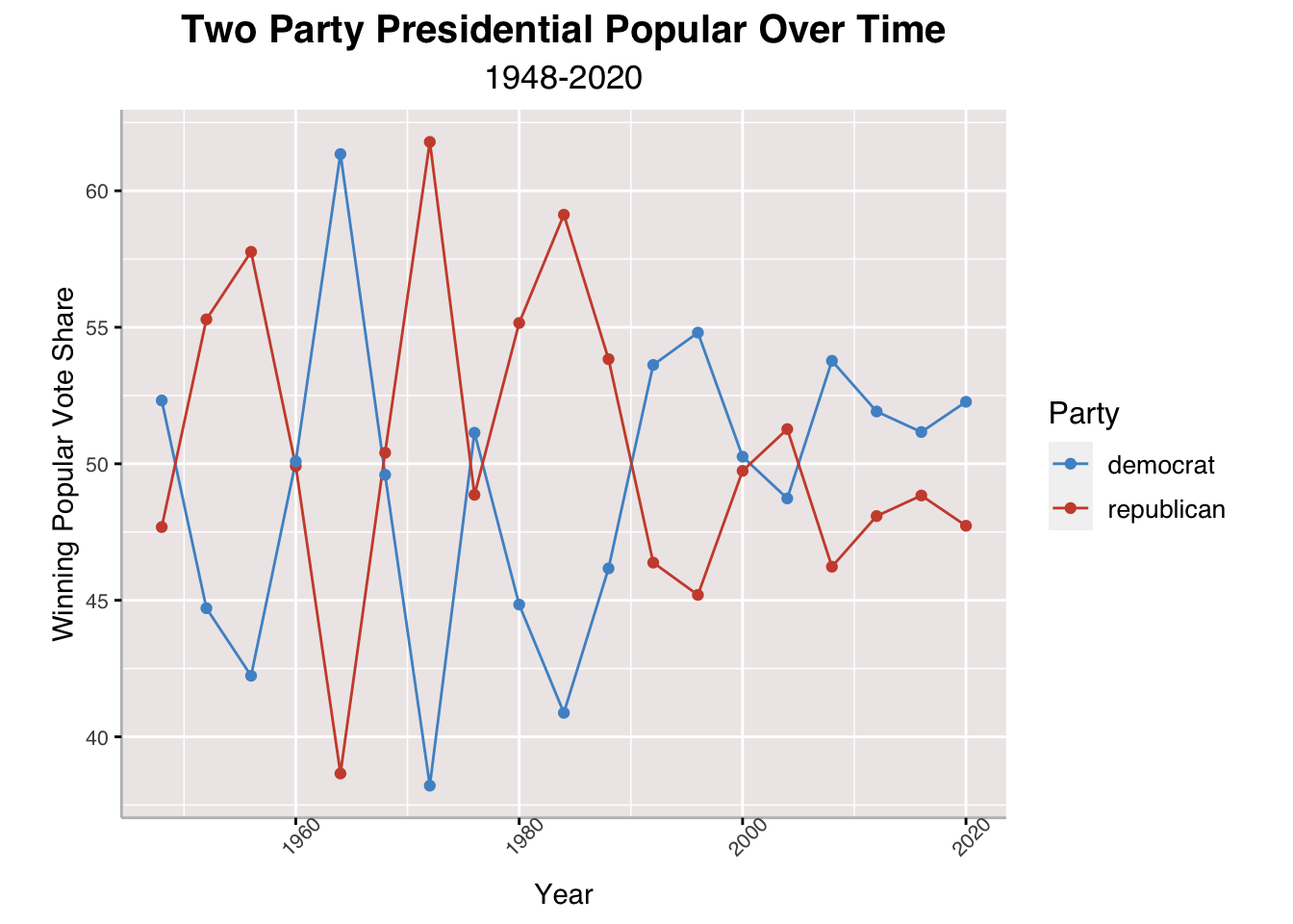
The above line chart helps visualize an answer to our question on the competitiveness of presidential elections in the United States. Broadly speaking, I would say that the presidential races are very competitive between the two main parties, Democrats and Republicans. The chart shows that no one party has a solidified dominance over the popular vote, though it is noteworthy that Democrats have won the popular vote for the past four elections. According to findings in Gallup from 2021, partisan identification with either Democrats or Republicans is relatively the same but independents remain the largest group of American voters, hinting their potential to sway elections differently each election (Jones 2022). Popular vote is not necessarily how candidates win the presidency, though, so let’s take a look at state and electoral vote data.
####----------------------------------------------------------#
#### State-by-state map of presidential popular votes.
####----------------------------------------------------------#

# Sequester shapefile of states from `maps` library.
states_map <- map_data("state")
unique(states_map$region)
##  [1] "alabama"              "arizona"              "arkansas"
##  [4] "california"           "colorado"             "connecticut"
##  [7] "delaware"             "district of columbia" "florida"
## [10] "georgia"              "idaho"                "illinois"
## [13] "indiana"              "iowa"                 "kansas"
## [16] "kentucky"             "louisiana"            "maine"
## [19] "maryland"             "massachusetts"        "michigan"
## [22] "minnesota"            "mississippi"          "missouri"
## [25] "montana"              "nebraska"             "nevada"
## [28] "new hampshire"        "new jersey"           "new mexico"
## [31] "new york"             "north carolina"       "north dakota"
## [34] "ohio"                 "oklahoma"             "oregon"
## [37] "pennsylvania"         "rhode island"         "south carolina"
## [40] "south dakota"         "tennessee"            "texas"
## [43] "utah"                 "vermont"              "virginia"
## [46] "washington"           "west virginia"        "wisconsin"
## [49] "wyoming"
# Read wide version of dataset that can be used to compare candidate votes with one another.
d_pvstate_wide <- read_csv("clean_wide_state_2pv_1948_2020.csv")
## Rows: 959 Columns: 14
## ── Column specification ────────────────────────────────────────────────────────
## Delimiter: ","
## chr  (1): state
## dbl (13): year, D_pv, R_pv, D_pv2p, R_pv2p, D_pv_lag1, R_pv_lag1, D_pv2p_lag...
##
## ℹ Use `spec()` to retrieve the full column specification for this data.
## ℹ Specify the column types or set `show_col_types = FALSE` to quiet this message.
# Merge d_pvstate_wide with state_map.
d_pvstate_wide$region <- tolower(d_pvstate_wide$state)

pv_map <- d_pvstate_wide |>
  filter(year == 2020) |>
  left_join(states_map, by = "region")

# Make map grid of state winners for each election year available in the dataset.

pv_win_map <- pv_map |>
  mutate(winner = ifelse(R_pv > D_pv, "republican", "democrat"))

pv_win_map |>
  ggplot(aes(long, lat, group = group)) +
  geom_polygon(aes(fill = winner), color = "black") +
  scale_fill_manual(values = c("steelblue", "tomato3")) +
  theme_void() +
  labs(title = "Map Grid of State Winners",
       subtitle = "2020 Election") +
  my_prettier_theme() +
  theme(axis.title.x= element_blank(),
        axis.title.y= element_blank(),
        axis.text.x= element_blank(),
        axis.text.y= element_blank(),
        axis.ticks = element_blank(),
        axis.line= element_blank())
ggsave ("figures/PV_win_map.png")
## Saving 7 x 5 in image
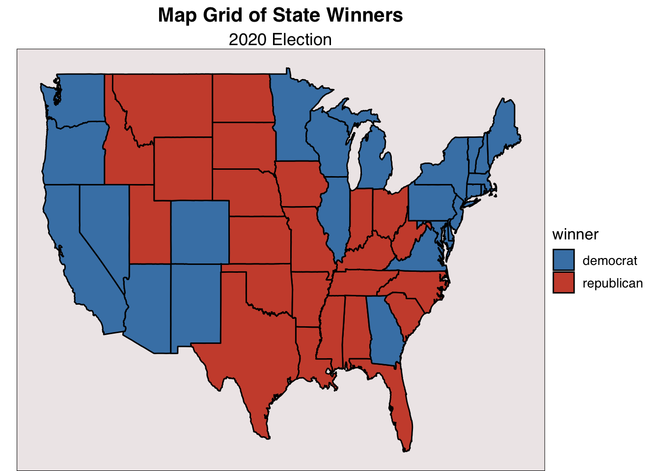
Here, I have coded which candidate won in each state during the 2020 election between President Joe Biden and President Donald Trump. Democrats did very well along the coasts and Republicans the midwest and South with the notable exception of Georgia. Throughout this blog, I will draw consistent attention onto Georgia because it is my home state and I find its political behavior interesting.
d_pvstate_wide |>
  filter(year >= 1980) |>
  left_join(states_map, by = "region") |>
  mutate(winner = ifelse(R_pv2p>D_pv2p, "republican", "democrat")) |>
  ggplot(aes(long, lat, group = group)) +
  facet_wrap(facets = year ~.) +
  geom_polygon(aes(fill = winner), color = "white")+
  scale_fill_manual(values = c("steelblue", "tomato3")) +
  labs(title = "Presidential Vote Share by State",
       subtitle = "1980-2020") +
  theme(strip.text = element_text(size = 12),
        aspect.ratio = 1) +
  my_prettier_theme() +
  theme(axis.title.x= element_blank(),
        axis.title.y= element_blank(),
        axis.text.x= element_blank(),
        axis.text.y= element_blank(),
        axis.ticks = element_blank(),
        axis.line= element_blank())
## Warning in left_join(filter(d_pvstate_wide, year >= 1980), states_map, by = "region"): Detected an unexpected many-to-many relationship between `x` and `y`.
## ℹ Row 1 of `x` matches multiple rows in `y`.
## ℹ Row 1 of `y` matches multiple rows in `x`.
## ℹ If a many-to-many relationship is expected, set `relationship =
##   "many-to-many"` to silence this warning.
ggsave ("figures/PV_states_historical.png")
## Saving 7 x 5 in image
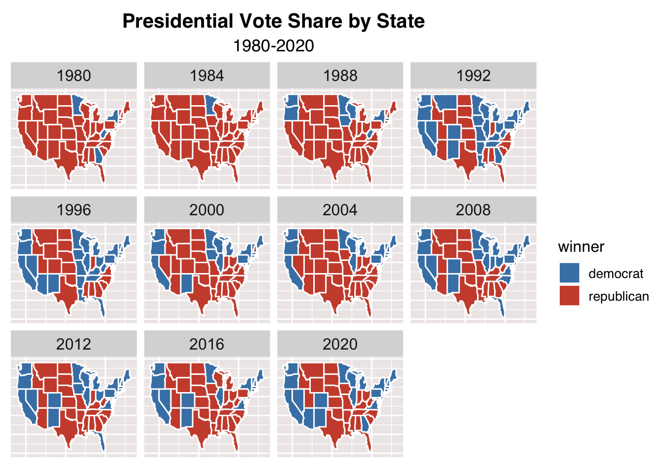
Placing the last map in context, we can see how certain states have either shifted parties (in the sense of having a preference for one party over another) or flip-flopped between elections over time. Something that sticks out to me is that California had pretty consistently voted Republican until 1992 when it firmly switched Democrat. New York has cast its electoral votes for Democrats for all elections in this period except 1984. Certain regions like the Midwest are solidly Republican from 1980 to 2020 and states like Texas, Alabama, Mississippi, South Carolina are firmly red. It appears that in the past few elections most states vote for a single party pretty consistently, but there exist certain states that swing either way.
####----------------------------------------------------------#
#### Forecast: simplified electoral cycle model.
####----------------------------------------------------------#

# Create prediction (pv2p and margin) based on simplified electoral cycle model:
# vote_2024 = 3/4*vote_2020 + 1/4*vote_2016 (lag1, lag2, respectively).

pv2p_2024_states <- d_pvstate_wide |>
  filter(year == 2020) |>
  group_by(state)|>
  summarize(R_pv2p_2024 = .75*R_pv2p + .25*R_pv2p_lag1,
            D_pv2p_2024 = .75*D_pv2p + .25*D_pv2p_lag1) |>
  mutate(pv2p_2024_margin = R_pv2p_2024 - D_pv2p_2024,
         winner = ifelse(R_pv2p_2024 > D_pv2p_2024, "R", "D"),
         region = tolower(state))

pv2p_2024_states_2 <- pv2p_2024_states

# Plot the margin of victory in a U.S. state map.

states_map <- map_data("state")

state_mapa <- pv2p_2024_states |>
  left_join(states_map, by = "region")
state_centers <- data.frame(state.center, state.abb, state.name)

state_mapa <- state_mapa |>
  ggplot(aes(long, lat, group = group)) +
  geom_polygon(aes(fill = pv2p_2024_margin), color = "black")+
  scale_fill_gradient2(high = "tomato3",
                       low = "steelblue3",
                       mid = "white",
                       name = "Two-Party Win Margin",
                       breaks = c(-50, -25, 0, 25, 50),
                       limits = c(-50,50)) +
  labs(title = "2024 Presidential Forecast",
       subtitle = "Simplified Electoral Cycle Model") +
  my_prettier_theme() +
  theme(axis.title.x= element_blank(),
        axis.title.y= element_blank(),
        axis.text.x= element_blank(),
        axis.text.y= element_blank(),
        axis.ticks = element_blank(),
        axis.line= element_blank())

state_mapa
ggsave("figures/PV2024_simple_forecast.png")
## Saving 7 x 5 in image
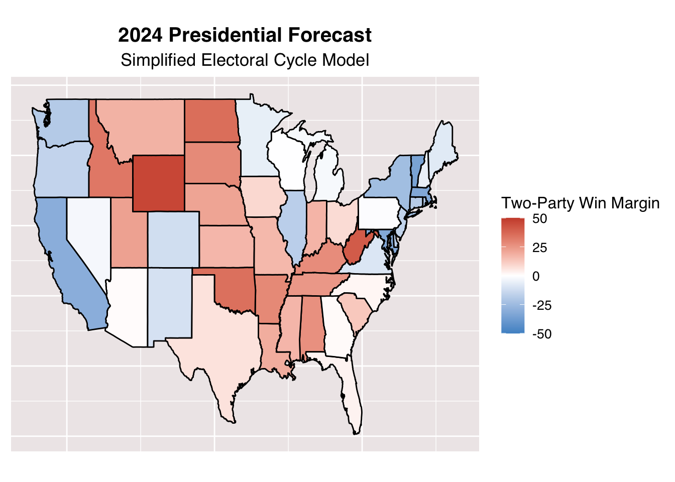
For the above map, we rely on a very basic mathematical model to predict the outcome of the upcoming election. It works as a such: in a given state, we can find the popular vote in the 2024 election by \(vote_{2024} = \frac{3}{4}*vote_{2020} + \frac{1}{4}*vote_{2016}\). From there, we can color code each state on a gradient, which relies on the projected win margin for the two main parties. We find that states that are consistently red or blue tend to stay that way. The battleground states, which are those closest to white, are Pennsylvania, Georgia, Wisconsin, North Carolina, Nevada, and Arizona. This falls in line with generally accepted knowledge about the political behavior in these states. One thing that surprised me though was how close Texas is to being a battleground state based on this projection.
####----------------------------------------------------------#
#### Extension 1: Add state labels
####----------------------------------------------------------#
# Rename ggplot state data region variable to state for ease
states_map <- map_data("state") |>
  rename(state = region)

# Transform state boundaries into an sf object
states_sf <- st_as_sf(states_map, coords = c("long", "lat"), crs = 4326, agr = "constant")

# Create a geometry for each state
states_sf <- states_sf |>
  group_by(state) |>
  summarize(geometry = st_combine(geometry)) |>
  st_cast("POLYGON") |>
  st_make_valid()

# Merge with your election results data
pv2p_2024_states <- pv2p_2024_states |>
  mutate(state = tolower(state))

# Merge state polygons with 2024 vote margin data
states_sf <- left_join(states_sf, pv2p_2024_states, by = "state")

# Create an interactive map with leaflet
interactive_map <- leaflet(states_sf) |>
  addTiles() |>
  addPolygons(
    fillColor = ~colorBin(palette = c("steelblue3", "white", "tomato3"),
                          domain = states_sf$pv2p_2024_margin,
                          bins = c(-50, -25, 0, 25, 50))(pv2p_2024_margin),
    fillOpacity = 0.7,
    color = "black",
    weight = 1,
    highlight = highlightOptions(
      weight = 3,
      color = "#666",
      fillOpacity = 0.7,
      bringToFront = TRUE
    ),
    label = ~paste(str_to_title(state), " Win Margin: ", round(pv2p_2024_margin,2)),
    labelOptions = labelOptions(
      style = list("font-weight" = "normal", padding = "5px 10px"),
      textsize = "15px",
      direction = "auto"
    )
  ) |>
  addLegend(
    pal = colorBin(palette = c("steelblue3", "white", "tomato3"),
                   domain = states_sf$pv2p_2024_margin,
                   bins = c(-50, -25, 0, 25, 50)),
    values = ~pv2p_2024_margin,
    opacity = 0.7,
    title = "Two-Party Win Margin (%)",
    position = "bottomleft"
  ) |>
  addControl(
    html = "<h3 style='color: black; text-align: center;'>2024 Presidential Forecast</h3><h5>Simplified Electoral Cycle Model</h5>",
    position = "topright",
    className = "map-title")
## Warning in colorBin(palette = c("steelblue3", "white", "tomato3"), domain =
## states_sf$pv2p_2024_margin, : Some values were outside the color scale and will
## be treated as NA
interactive_map
If you are unfamiliar with American geography, here is an interactive version of the same map, where you can see state labels and what notable cities are in each state.
# Generate projected state winners and merge with electoral college votes to make
# summary of electoral college vote distributions.
ec <- read_csv("ec_full.csv")
## Rows: 1010 Columns: 4
## ── Column specification ────────────────────────────────────────────────────────
## Delimiter: ","
## chr (2): state, stateab
## dbl (2): year, electors
##
## ℹ Use `spec()` to retrieve the full column specification for this data.
## ℹ Specify the column types or set `show_col_types = FALSE` to quiet this message.
pv2p_2024_states_2 <- pv2p_2024_states_2 |>
  mutate(year = 2024)|>
  left_join(ec, by = c("state", "year"))

projected_electoral_winner <- pv2p_2024_states_2 |>
  group_by(winner)|>
  summarize(electoral_votes = sum(electors))

projected_electoral_winner
## # A tibble: 2 × 2
##   winner electoral_votes
##   <chr>            <dbl>
## 1 D                  276
## 2 R                  262
Harris: 276 #
Trump: 262 #
Using the formula we drew on before, we can determine which states will (by this model) cast their electoral votes for Democrats and which will for Republicans. Then, we tally up the totals and find that Democrats pass the threshold of 270 to win the office. Based on this very rudimentary model, Kamala Harris is projected to be the next president of the United States.
You can find my code for this entry by clicking on the Github link to the right. Please reach out if you encounter any errors.
Sources #
Grimmer, Justin. “Don’t Trust the Election Forecasts.” POLITICO, POLITICO, 3 Sept. 2024, www.politico.com/news/magazine/2024/09/03/election-forecasts-data-00176905.
Jones, Jeffrey M. “U.S. Political Party Preferences Shifted Greatly During 2021.” Gallup, 17 Jan. 2022, https://news.gallup.com/poll/388781/political-party-preferences-shifted-greatly-during-2021.aspx.
Data Provided by GOV 1347: Election Analytics teaching staff.